American Express
In 2021, I joined American Express as a Senior UI Designer to support a significant evolution of the company’s Design Language System (One DLS). The DLS is a cross-platform design system used by more than 400 designers and 1,500 developers across 350+ products, spanning web, mobile, and email. It plays a critical role in ensuring consistency, accessibility, and quality across every customer interaction.
The team was transitioning from a legacy Sketch-based system to a new, unified Figma library. My role was to help define, build, and document the first iteration of the DLS v6 Figma kit - a foundational step that would influence design and engineering workflows across the entire enterprise.
I became deeply embedded in the team, working across design, product, and engineering to modernise the system and improve how thousands of people would design at scale.
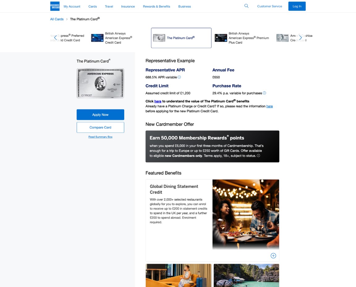
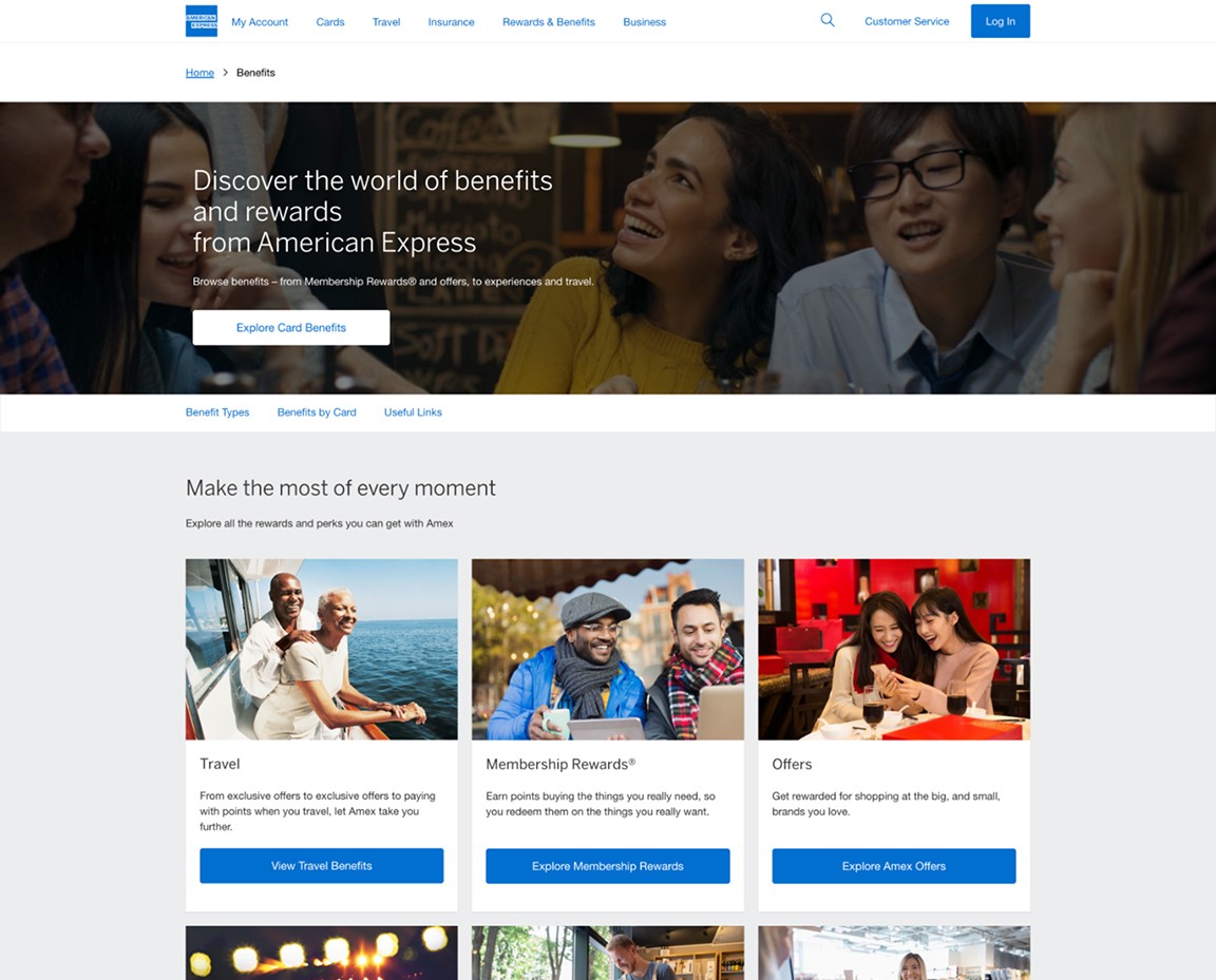
Examples of American Express UI
Challenges
A fragmented tool environment
Teams across the company were working in different tools, with varying versions of the Sketch kit and inconsistent Figma pilots. This led to duplication, drift, and unclear standards.
Outdated component structure
The existing system needed clearer rules, scalable component architecture, and modern Figma techniques to support complex design workflows. Many components were inconsistently built or difficult to maintain.
Lack of unified governance
There was no established process for versioning, distribution, or updating the library in Figma, making it difficult for teams to trust that they were using the latest patterns.
Enterprise-level communication needs
With hundreds of designers relying on the DLS daily, the rollout required coordination, clarity, and a shift in how the organisation thought about shared systems.
Opportunity
The transition to Figma was a moment for American Express to rethink its system from the ground up. A modernised DLS would:
Support large-scale collaboration across hundreds of designers
Reduce duplication and inconsistency
Improve speed-to-market by providing stable, well-structured components
Strengthen accessibility and brand coherence
Increase trust in the system through better documentation and governance
The goal was not just to rebuild what existed, but to create a scalable, reliable foundation that could support the next generation of Amex product experiences.
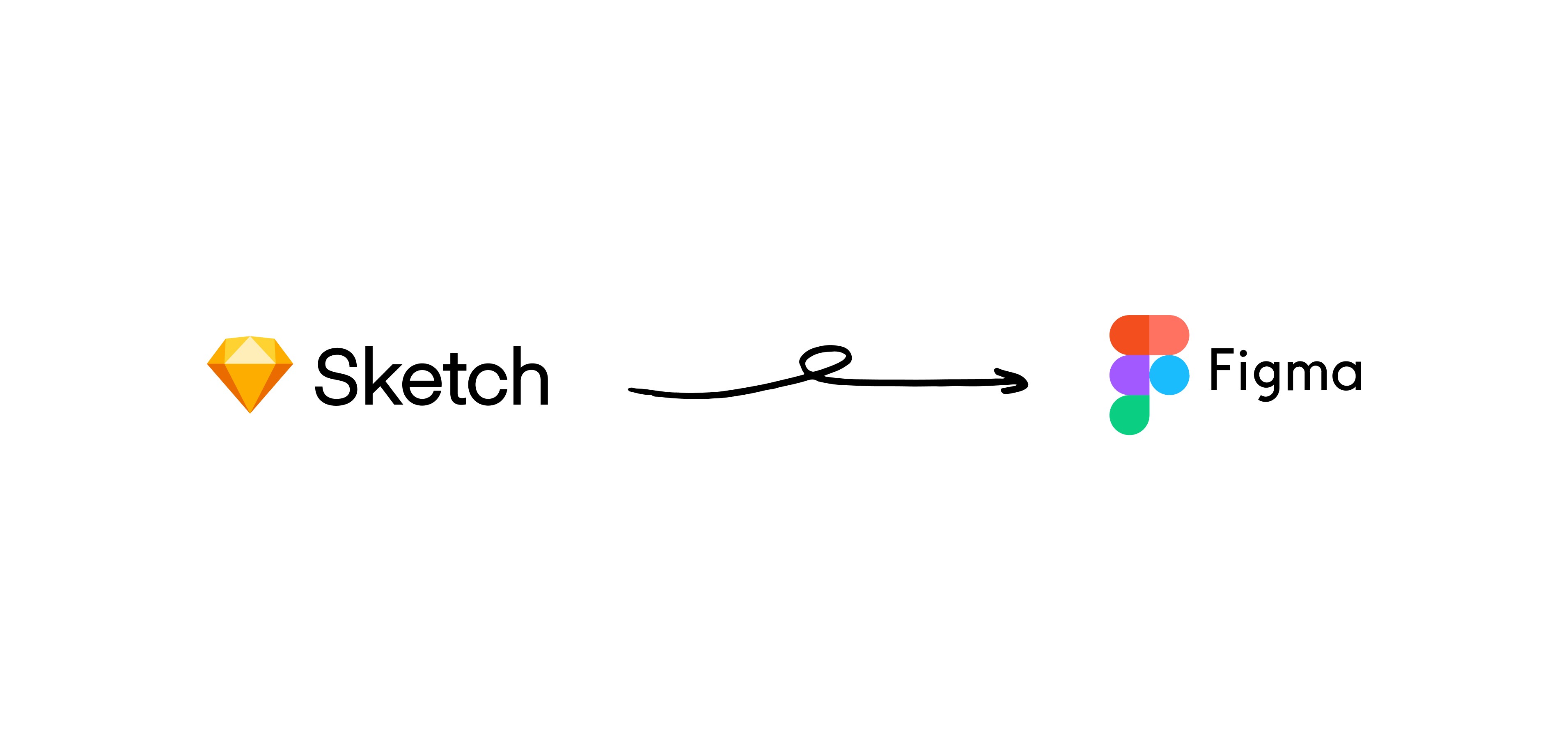
DLS was originally built in Sketch
Role
As Senior UI Designer on the DLS team, I was responsible for:
Mapping the structure of the new Figma system
Defining component architecture and naming conventions
Building the MVP library and its foundational components
Partnering with designers across pilot teams to gather feedback
Aligning with engineering on feasibility and implementation
Creating documentation for future component creation
Supporting the broader design community through Slack and weekly office hours
The role required autonomy, a systems mindset, and a strong ability to communicate decisions across a large organisation.
Research
Understanding the system landscape
I began by reviewing the existing Sketch kit, legacy Figma files, pilot libraries, and historical documentation. This helped clarify what worked, what didn’t, and where the biggest opportunities for improvement existed.
Designer workflow interviews
Through office hours, Slack conversations, and scheduled sessions with pilot teams, I gathered insights into:
How designers were currently using the DLS
Where components broke or caused friction
How naming conventions affected search and reuse
What was missing from the system
Where inconsistencies created confusion
Technical alignment
I joined backend and engineering discussions to ensure the Figma system aligned with implementation constraints. Engineers regularly joined my weekly drop-in sessions to discuss usage and front-end implications, ensuring that design and engineering remained in sync.
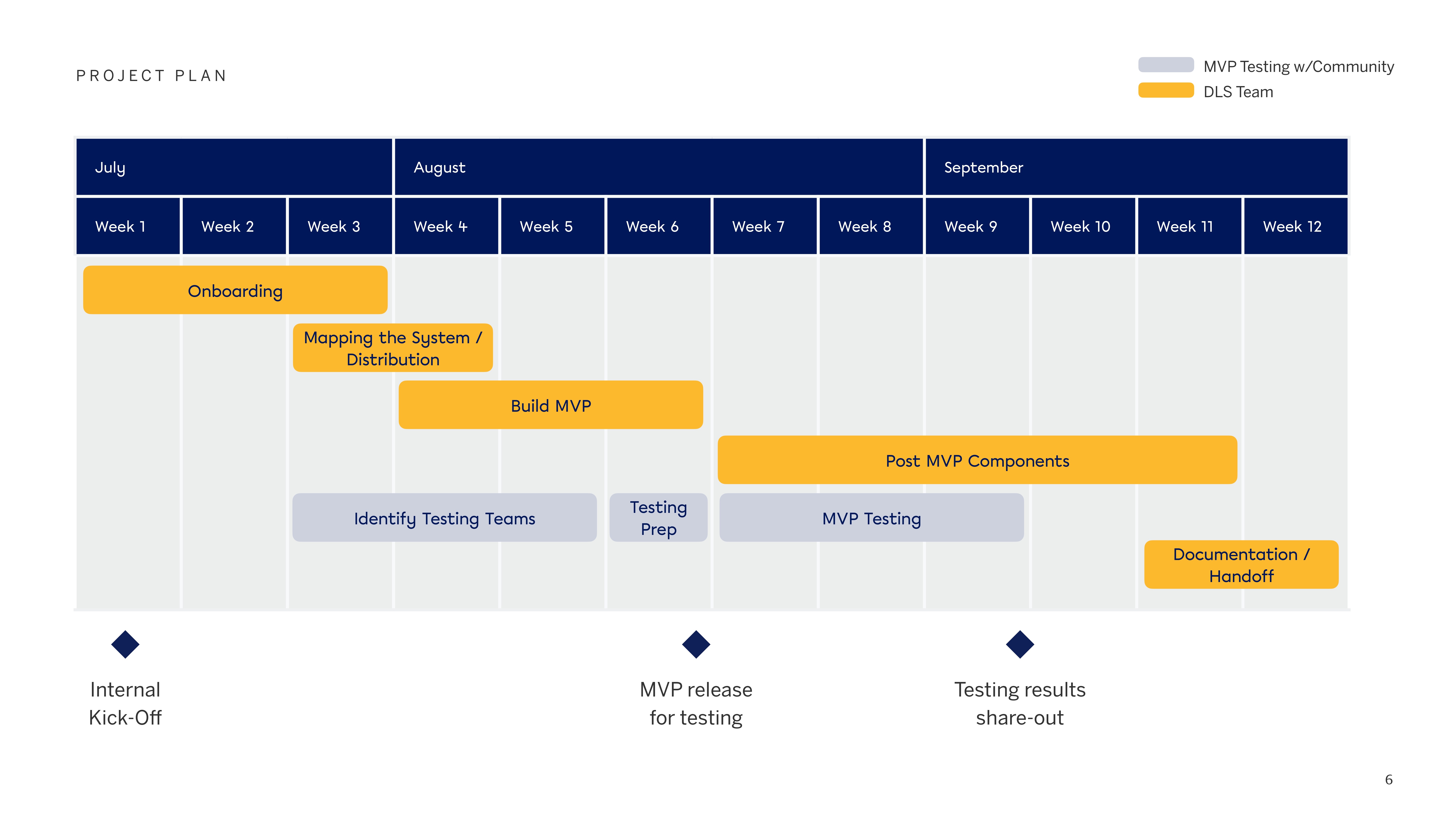
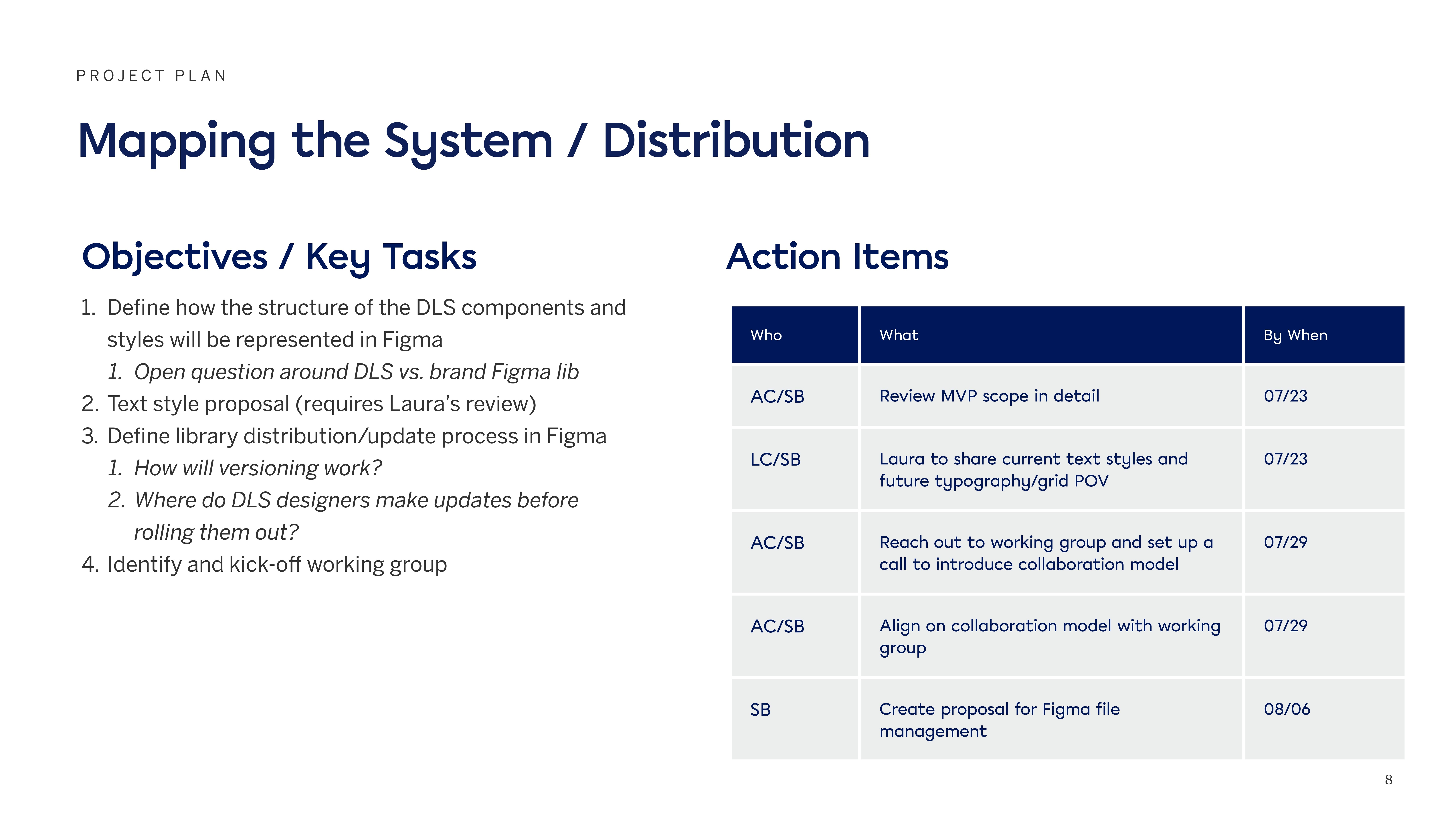
Project timeline
Strategy
Mapping the system
Working with the DLS team, I helped define how components, styles, and foundations would be structured in Figma. This included clear separation of:
Foundations (colors, typography, icons, spacing)
Components and their variants
Usage guidance and documentation
This architectural mapping created the blueprint for the entire library.
Establishing naming and governance
I proposed a unified naming convention and system for versioning, as well as a library release process that ensured updates were distributed consistently across teams. This governance work became critical to maintaining trust in the system at scale.
Collaboration model
I partnered with a working group of designers to review components weekly, gather feedback, and validate decisions before rollout.
Initial planning phase
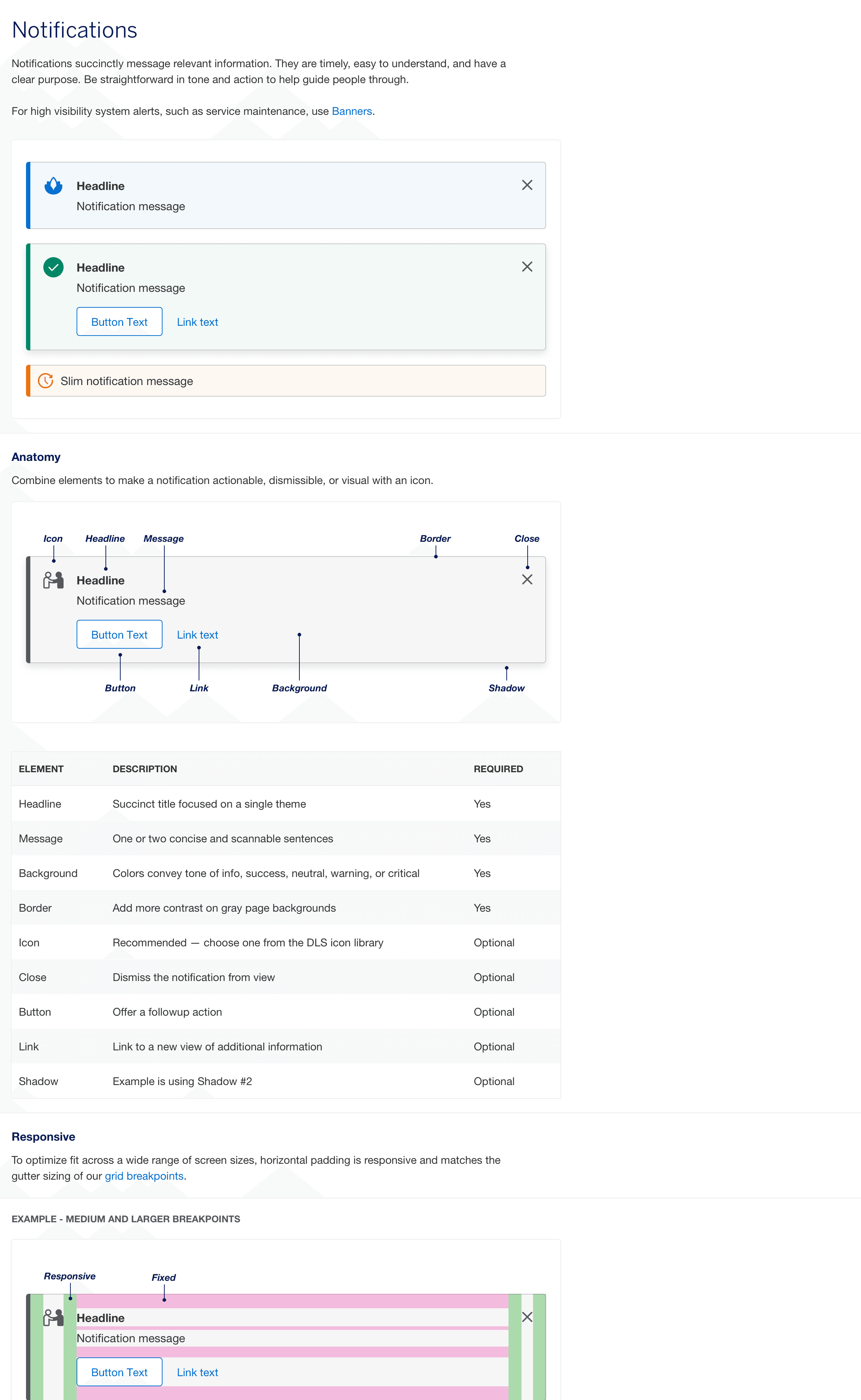
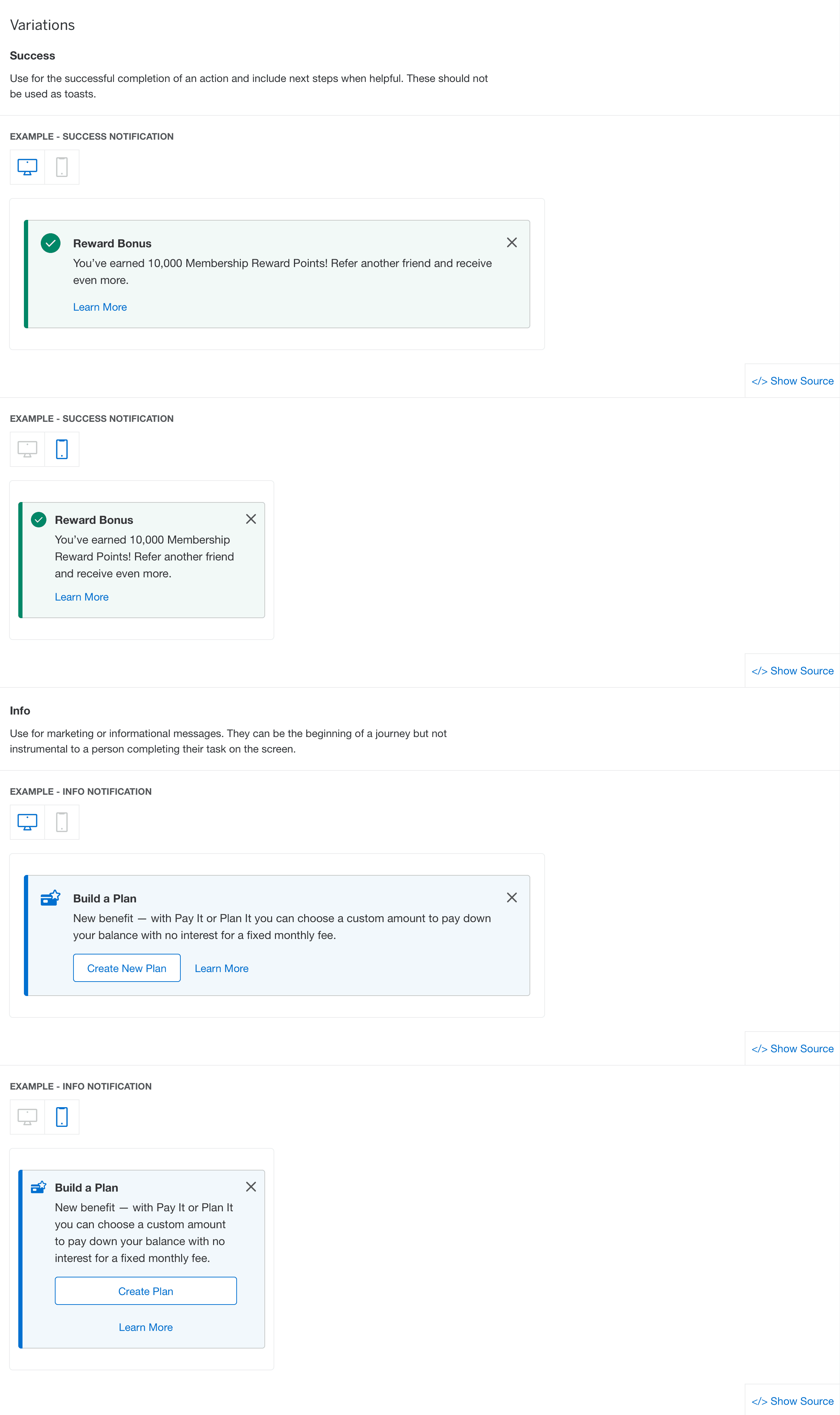
Building the MVP
The MVP included the most widely used components across the organisation - everything from buttons and inputs to cards, tabs, breadcrumbs, and tooltips. The goal was to establish a solid, reliable base before expanding into more complex patterns.
My work included:
Setting up the master Figma library
Rebuilding components using modern Figma best practices
Ensuring proper constraints, variants, and auto-layout structures
Documenting edge cases and usage expectations
Sharing weekly WIP updates with the working group
The result was a more stable, scalable, and predictable system that designers could rely on immediately.
Example components
Testing and iteration
After the MVP build, we ran structured testing with selected product teams. I helped:
Define testing criteria and coverage
Guide teams through how to evaluate the system
Synthesize findings into actionable changes
Prioritise updates for post-MVP work
This collaborative process strengthened adoption and ensured the system reflected real-world needs.
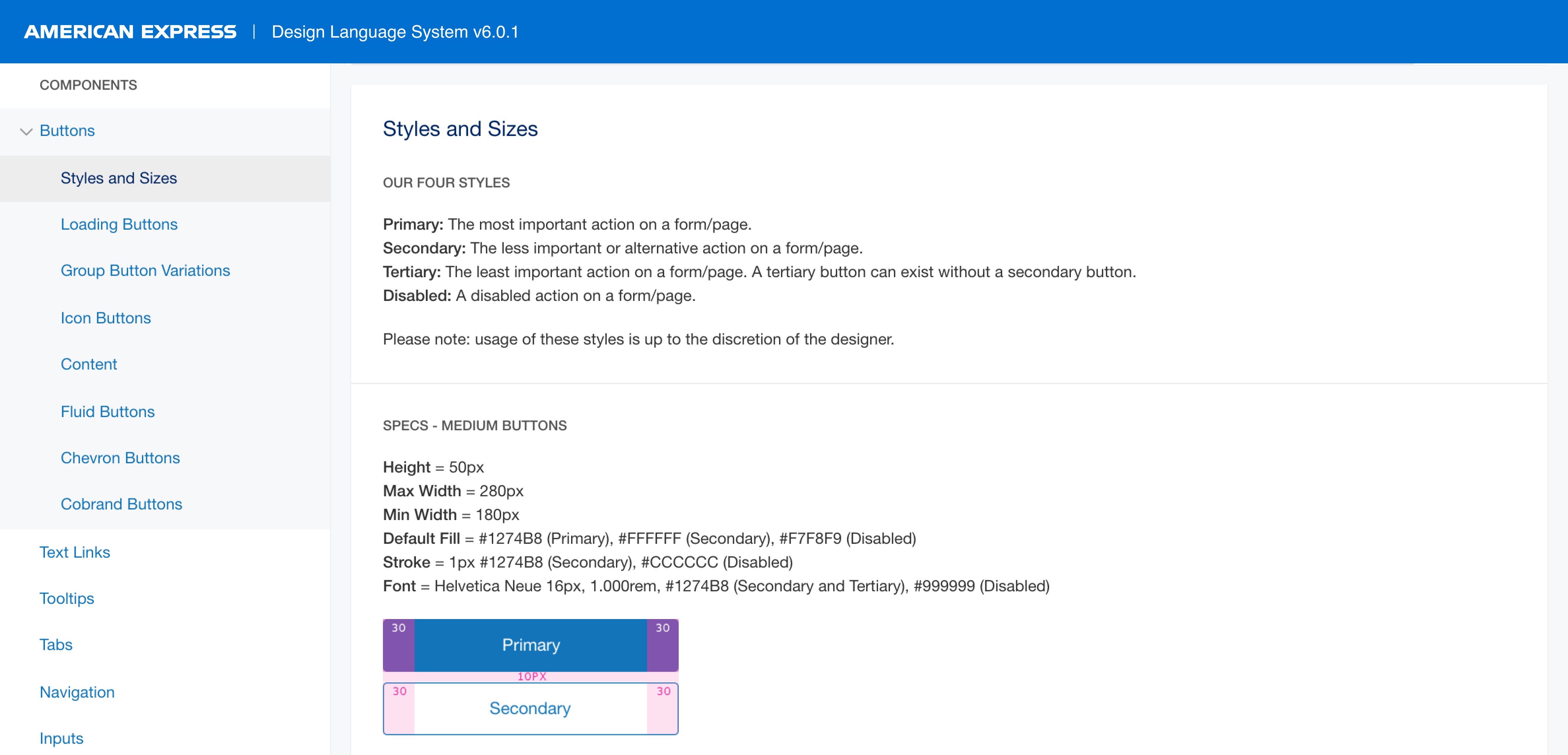
Documentation and handoff
To ensure longevity and clarity, I created documentation that covered:
Naming conventions
Component creation checklists
Update and release processes
Recommended Figma plugins and workflows
These guidelines helped the team scale its output and ensured future designers could contribute to the system with confidence.
Interactive documentation
Impact
The DLS v6 Figma kit became the foundation for how American Express designs and ships products at scale. It now supports:
400+ designers
1,500+ developers
350+ digital products
The work improved consistency across platforms, reduced friction in day-to-day workflows, and provided a maintainable system architecture that the team continues to build on.
Reflection
Working on the American Express DLS was an opportunity to contribute to a system with massive reach - one that touches nearly every customer-facing experience at the company. The work reinforced the importance of:
Clear governance
Strong communication across disciplines
Predictable, well-structured component architecture
Designing not just for today’s needs, but for long-term scalability
Even within a short engagement, the project allowed me to help level up the system, bring coherence to its structure, and support hundreds of designers working across a global organisation.
It remains one of the most impactful systems projects I’ve been part of - not because of its complexity alone, but because of the people, the collaboration, and the shared commitment to raising the quality of design at Amex.
Recommendations
I am pleased to recommend Sam, who played a pivotal role on the Amex Design Systems team during our transition from Sketch to Figma. This migration was a major strategic initiative, requiring not only deep design expertise but also strong communication, cross-functional partnership, and a systems-thinking mindset. Throughout the project, Sam consistently demonstrated all of these qualities and more.
From the outset, Sam approached the migration with clarity and purpose—evaluating our existing Sketch libraries, identifying gaps and opportunities, and shaping a scalable, future-forward component architecture in Figma. His ability to translate complex technical constraints into elegant, intuitive design solutions accelerated our timelines and significantly improved the usability of our design system.
Thanks to his craftsmanship, attention to detail, and passion for systems thinking, Amex now has a more flexible, maintainable, and modern design ecosystem. The impact of his contributions has been felt for years to come.
I highly recommend Sam for any role that demands excellence in design systems, and the ability to deliver high-impact work in a complex, collaborative environment.
Laura Corbin, Director UX Design - Design Systems
I had the pleasure of working with Sam over the course of several months, where he exhibited strong craft expertise in building out a design system in Figma, as well as the ability to work autonomously and manage his time effectively. Over the course of the project, Sam completed his work with a high degree of professionalism and proactively made suggestions for improvements along the way. He engaged with stakeholders and sought buy-in for critical decisions, ensuring the success of our project. I cannot speak highly enough of Sam and look forward to working with him again in the future.
Alexandra Coym, Director - Design Systems